
 EN
EN
Exploring Color Psychology and Branding in Dining Spaces
The Hidden Impact of Visual Identity on Guest Perception
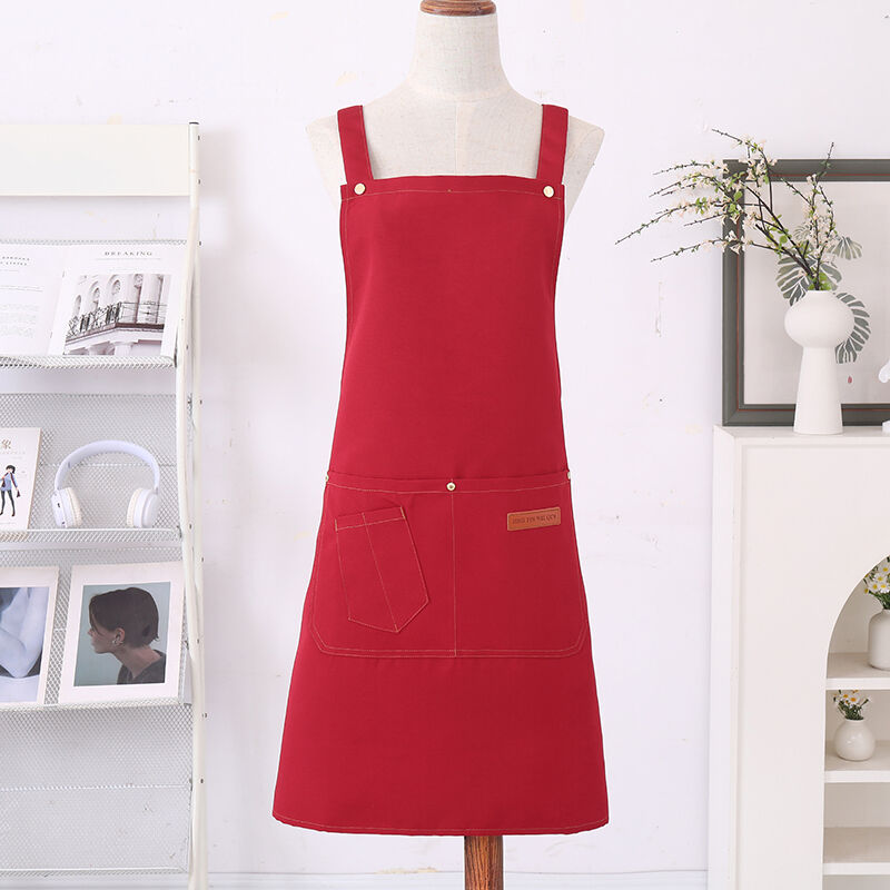
Selecting the perfect palette for front of house apparel involves much more than just matching the interior paint or wooden tables. In the competitive culinary world, every visual touchpoint shapes how guests perceive the quality of food and hospitality. A carefully chosen restaurant apron acts as a functional canvas that non-verbally communicates the core values of the establishment. Color psychology shows that specific undertones trigger immediate emotional responses in diners. For example, deep warm tones can stimulate appetite and create a cozy environment, while cool muted hues project modern sophistication and cleanliness. Hospitality experts often note that uniform color choices either reinforce the dining narrative or create visual confusion that dilutes the concept. Integrating these visual cues into staff apparel ensures that the team looks cohesive, professional, and completely aligned with the overarching market positioning of the business.
Establishing Emotional Connections Through Strategic Palette Selection
When evaluating options for a team uniform, understanding the cultural and psychological associations of different shades is vital for long term brand loyalty. Bright, energetic hues like brick red or warm amber work wonderfully in casual establishments, bistros, and fast-casual joints because they encourage lively conversation and quick table turnover. On the other end of the spectrum, fine dining venues and upscale bistros frequently lean toward dark charcoal, deep navy, or classic black tones for their staff apparel. These darker alternatives naturally hide unavoidable kitchen stains while projecting an aura of premium luxury and understated elegance. By choosing the right shade for a restaurant apron, operators can subtlely influence guest mood, making the dining environment feel more authentic, welcoming, and memorable for international travelers and local regulars alike.
Balancig Aesthetics with Textile Longevity and Care
Fabric Resilience and Structural Integrity under Heavy Usage
An appealing shade loses its marketing value completely if the textile begins to fade, fray, or look worn down after just a few commercial laundry cycles. Achieving a balance between visual beauty and industrial durability requires an understanding of modern textile blending techniques. High quality uniforms typically utilize heavyweight cotton canvases or advanced poly-cotton twills that lock in color pigments at a molecular level. These premium blended fabrics ensure that rich earth tones or bright custom pigments remain vibrant even when exposed to high temperature washings and harsh sanitizing agents. Investing in materials with high colorfastness ratings prevents the faded, unkempt appearance that can accidentally signal a lack of cleanliness to discerning guests, thereby preserving the professional image of the staff.
Maintenance Realities and Color Practicality in Busy Kitchens
Operational reality must always guide the final decision when investing in new apparel for kitchen or floor staff. Fine dining servers might look spectacular in cream or off-white tones, but maintaining those pristine surfaces in a high volume beverage or coffee environment requires constant vigilance. Practical operators often select intermediate shades like olive green, slate gray, or chocolate brown for a versatile restaurant apron. These specific colors offer the perfect compromise, providing a distinct brand identity while effectively masking minor splashes, coffee grounds, and oil spots during busy shifts. This practical approach ensures that front facing employees look impeccably clean from the opening shift until the final table leaves, maintaining brand trustworthiness without causing excessive uniform replacement costs.
Enhancing Global Supply Chains and Production Competence
Aligning Global Standards with Scalable Manufacturing Expertise
Creating a truly consistent international brand image across multiple locations requires a reliable manufacturing partner capable of executing precise dye matching and reliable textile replication. For businesses looking to scale their identity seamlessly without color variations between production batches, working with a deeply integrated manufacturer like CCJ provides significant strategic leverage. Utilizing advanced weaving technologies and robust global supply chain networks, CCJ ensures that every single batch of apparel meets strict international quality benchmarks and exact color specifications. This large scale manufacturing capability allows growing culinary brands to secure uniform consistency across diverse regions, ensuring that the brand message remains powerful, polished, and perfectly presented on a global stage.
Frequently Asked Questions:
How do dark colors impact the perception of cleanliness in a dining environment? Darker shades like charcoal and black project premium luxury and hide minor stains effectively, but they must be paired with high-quality fabrics to ensure they look crisp and lint-free rather than dusty.
Can poly cotton blends maintain color better than pure natural cotton fabrics? Yes, advanced poly-cotton blends generally offer superior color retention because synthetic fibers hold commercial dyes more permanently, reducing the fading caused by frequent hot water laundering.
What color choices are best recommended for open kitchen formats? For open kitchens where chefs are visible to guests, mid-toned neutrals like slate gray or navy blue are ideal because they look clean under bright lights while masking soot and grease spots.